
Bumblebee
#UX Research #End-to-end #Self-initiated
Parenting Support App based on children’s temperament
Bumblebee targets millennial parents who desire to actively engage in knowing about their children. This app offers parenting and discipline information based on each kid’s temperament and supports their journey by AI Bumblebee.

Story
Parenting evolves with each generation.
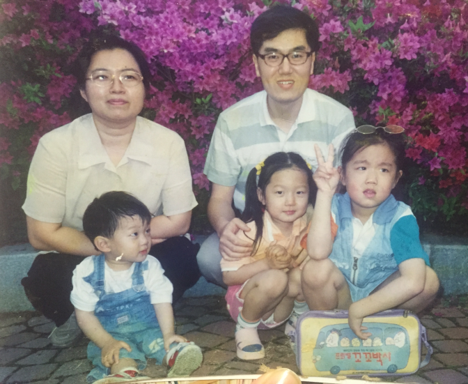
During holiday visits, my parents often express regret to my siblings and me for not recognizing our unique temperaments when raising us, simply because they didn’t know how.
Given their background as the children of Korean War survivors who were focused on settling financially, understanding the individual temperaments of their children was challenging for my parents’ generation due to a lack of experience and limited resources.
Now, with incredible economic growth and easy access to information, I’ve become curious about how millennial parents approach parenting. What do they prioritize, and what concerns arise in this more prosperous environment?
User Research
How are millennial parents doing?
I started getting more curious about how millennial parents are doing with parenting. The millennial generation was born from 1981 to 1996. This generation came of age in a digital landscape and achieved a degree of financial stability, which shaped their approach to parenting in this new era.
Interviewees: 6 (30s and early 40s) parents with kids under 12


Face: boys, ducks: girls

Interview approach
To ensure the most efficient outcomes of interviews, I revised my interview script six times, seeking feedback from a company manager.
I took the time to listen and patiently waited for participants to open up and share their struggles with me. Trust me, discussing topics such as raising children requires time. Using written words, I segregated key components into colored memo boxes and organized them from top to bottom based on the order of the questions. I chose to be flexible, asking questions naturally as they fit into the context, which required organizing the answers.
As a result of filtering the interview results organically twice, it became clear what challenges they were facing and where they needed assistance
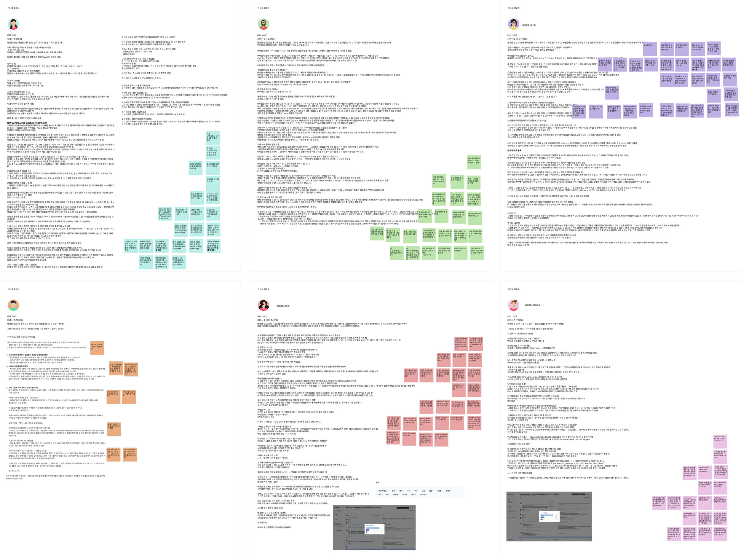
🌟 Key takeaways
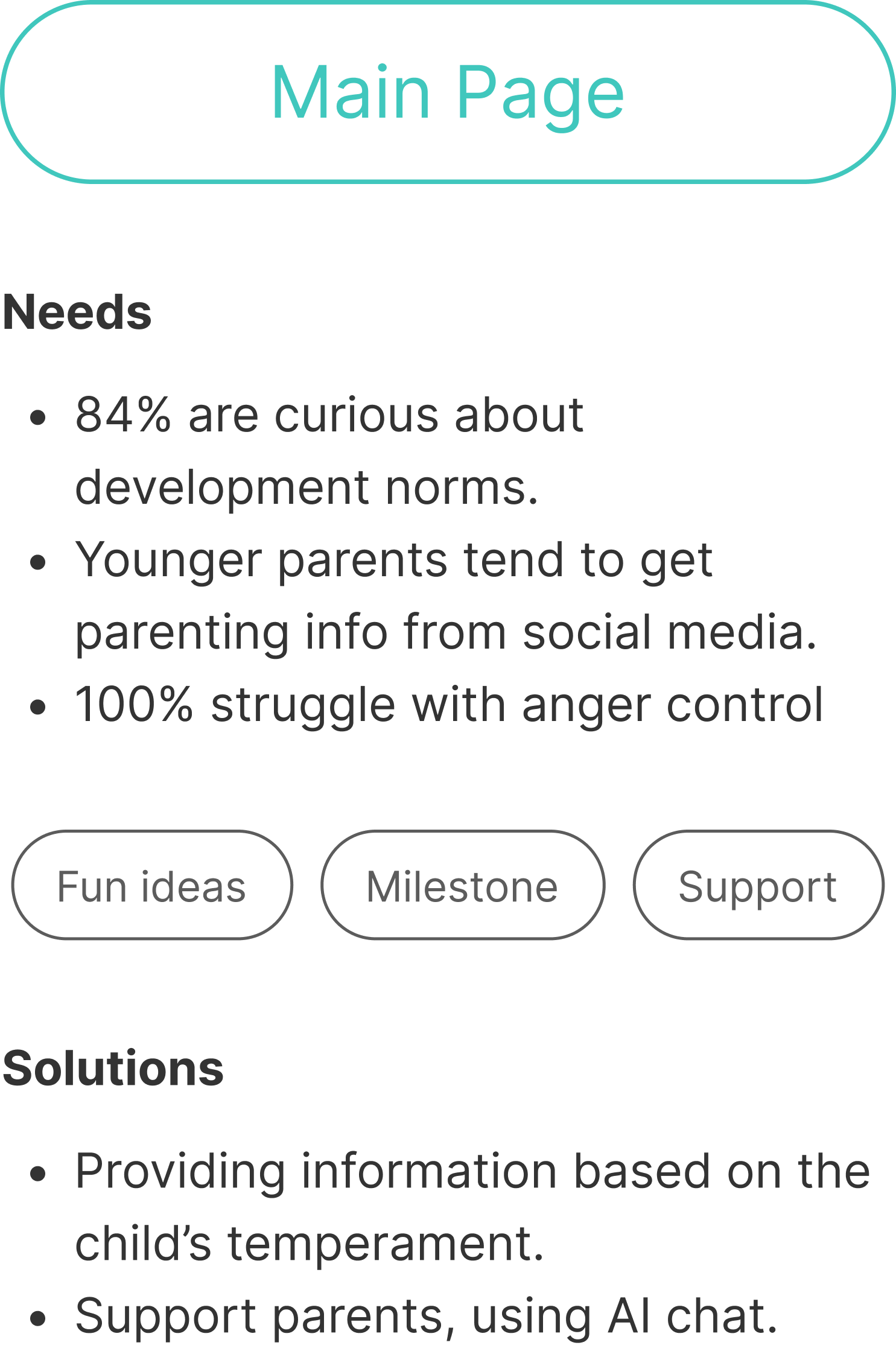
“We don’t trust parenting resources (books, websites, TV shows).” 84%
They answered that information on the internet or from books is too general. The advice doesn’t fit with parents’ beliefs, nor with their kids’ specific temperament, which causes more frustration 😩.
“Our everyday challenge is controlling emotions.” 100%
They were all trying really hard to be patient and to not get angry with their kids 😤.
“We realized that kids have different personalities and need different parenting and discipline styles to suit them.” 90%
They explained how they realized that each child is different based on their age, gender, birth order, and temperament, so they need different parenting styles. It took them some time to understand this 👧🏻👦🏼👧🏽👶.
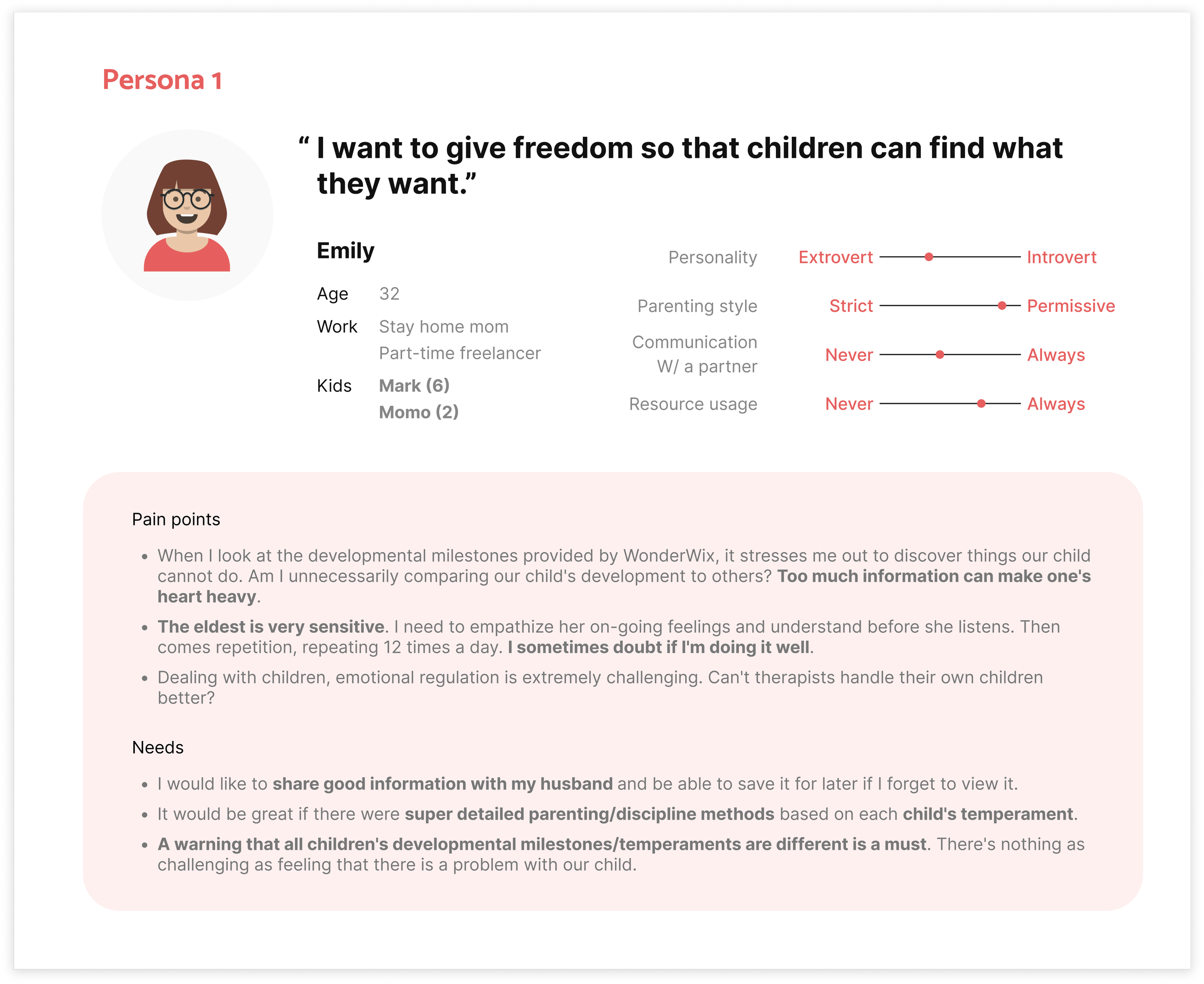
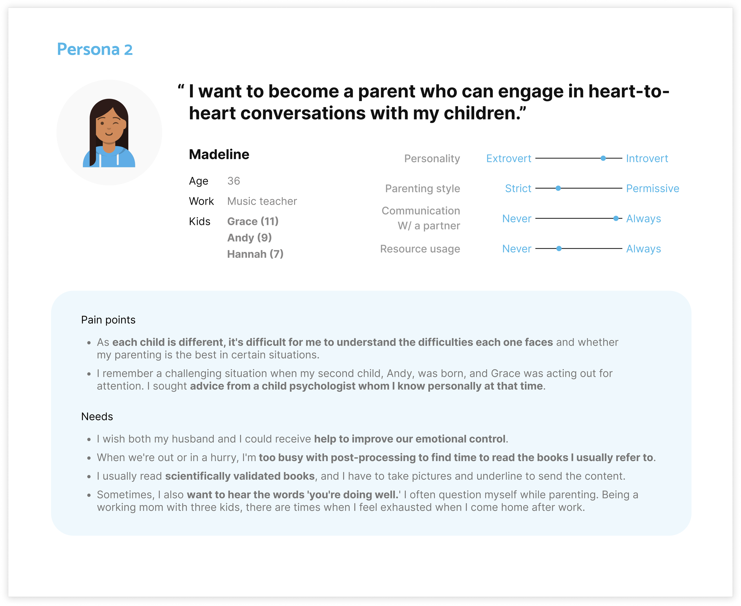
Persona
Let’s take a step further to understand users.
It’s fascinating how users’ needs and pain points might not be immediately apparent during interviews, but they become more evident when creating personas.
Please meet Emily and Madeline.
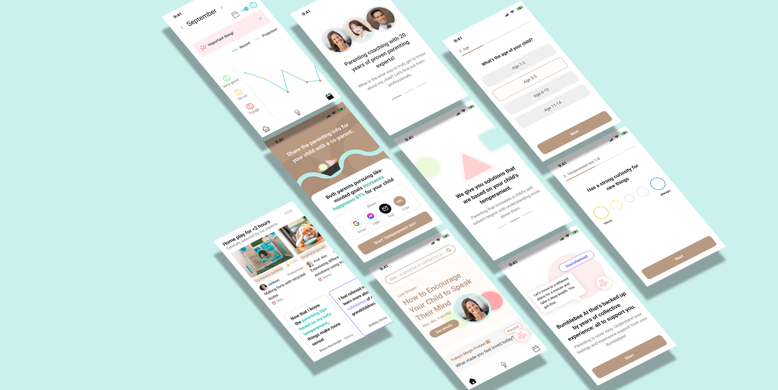
Needs and Solutions (# 1)
🗝 Key point: How do we provide advice based on each child’s temperament and support parents emotionally?
I collected common needs and pain points identified through interviews. Then I set a 20-minute timer, writing down potential solutions from practical to creative.
Following this, I categorized these solutions based on each main flow, prioritizing and presenting a Minimum Viable Product (MVP), providing a smooth user experience that meets their needs.
Needs and Solutions (#2)
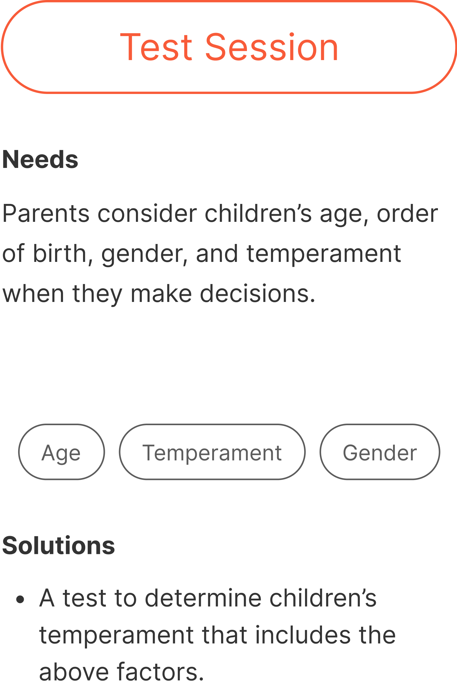
How can we address the needs of parents seeking a parenting approach that fits with their children’s temperament?
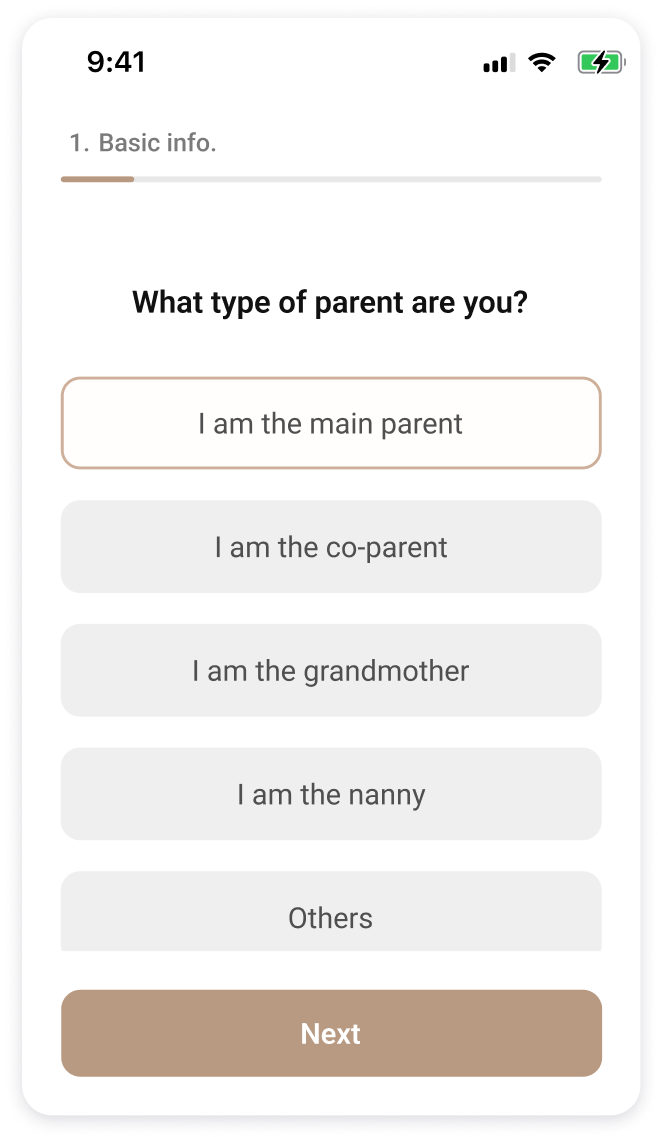
One key parental requirement was the need to customize their parenting strategies to align with the unique characteristics of each child.
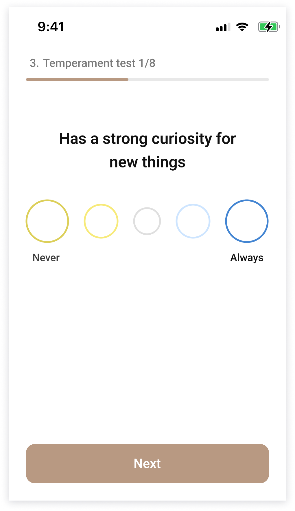
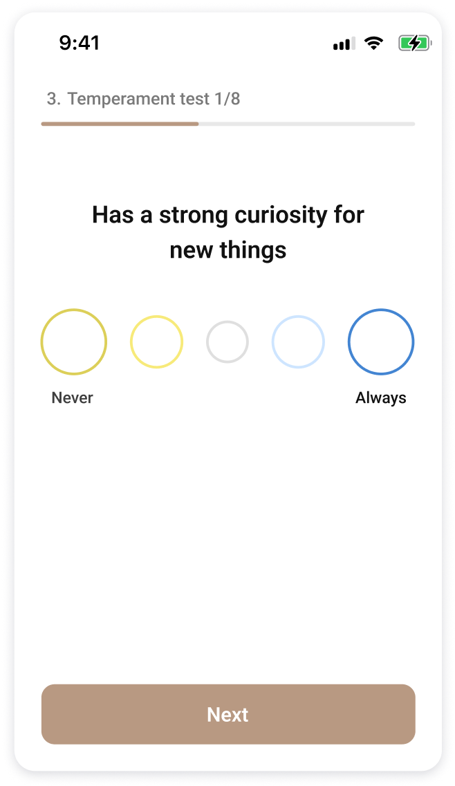
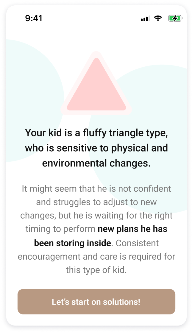
To address that need, my solution was to present a test for parents to take after the sign-up. These test questions involve children’s basic information — gender, age, birth order, etc. — as well as individual questions that analyze their temperament.
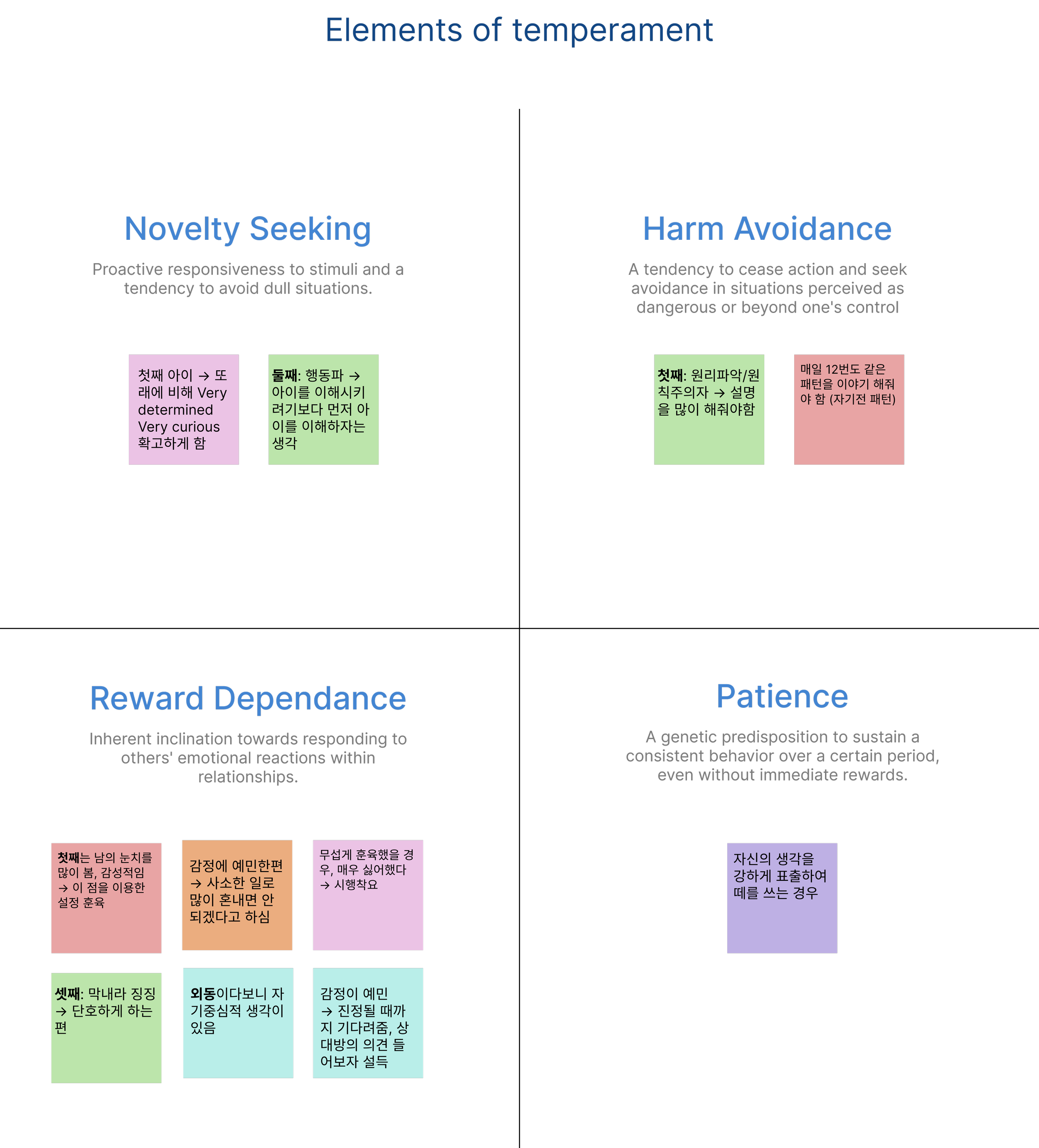
Out of all of those, temperament is the most important factor that forms who they are, and so I decided to dig even deeper. I read a book, The Customized Child Temperament Parenting Manual by Dr. Jung Ga-eun and watched over 130 episodes of My Little Golden Child by Dr. Oh Eun-young. Using Dr. Jung’s categories, I mapped out the following elements of a child’s temperament:
Challenge
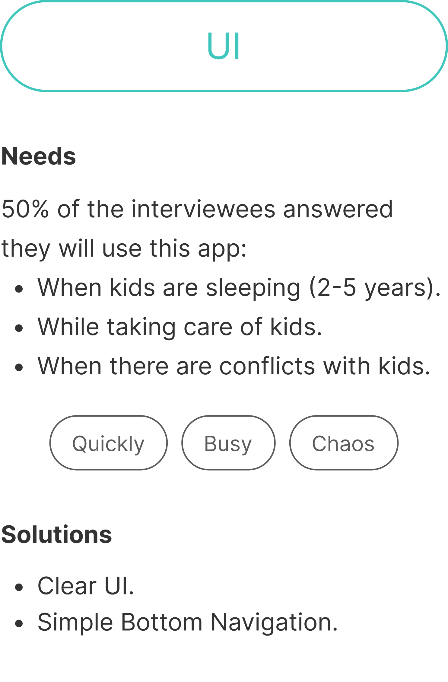
My challenge here is to create questions that parents could answer easily, yet yield enough detail to create a personalized experience for parents once they get to the main page.
Solution
Simple UI that flows from one step to the next, while implying that there is no good or bad choice when it comes to temperament. I used friendly colors that represent calm.
Easy and clear UX writing that is easily answered without probing for sensitive information.
Results
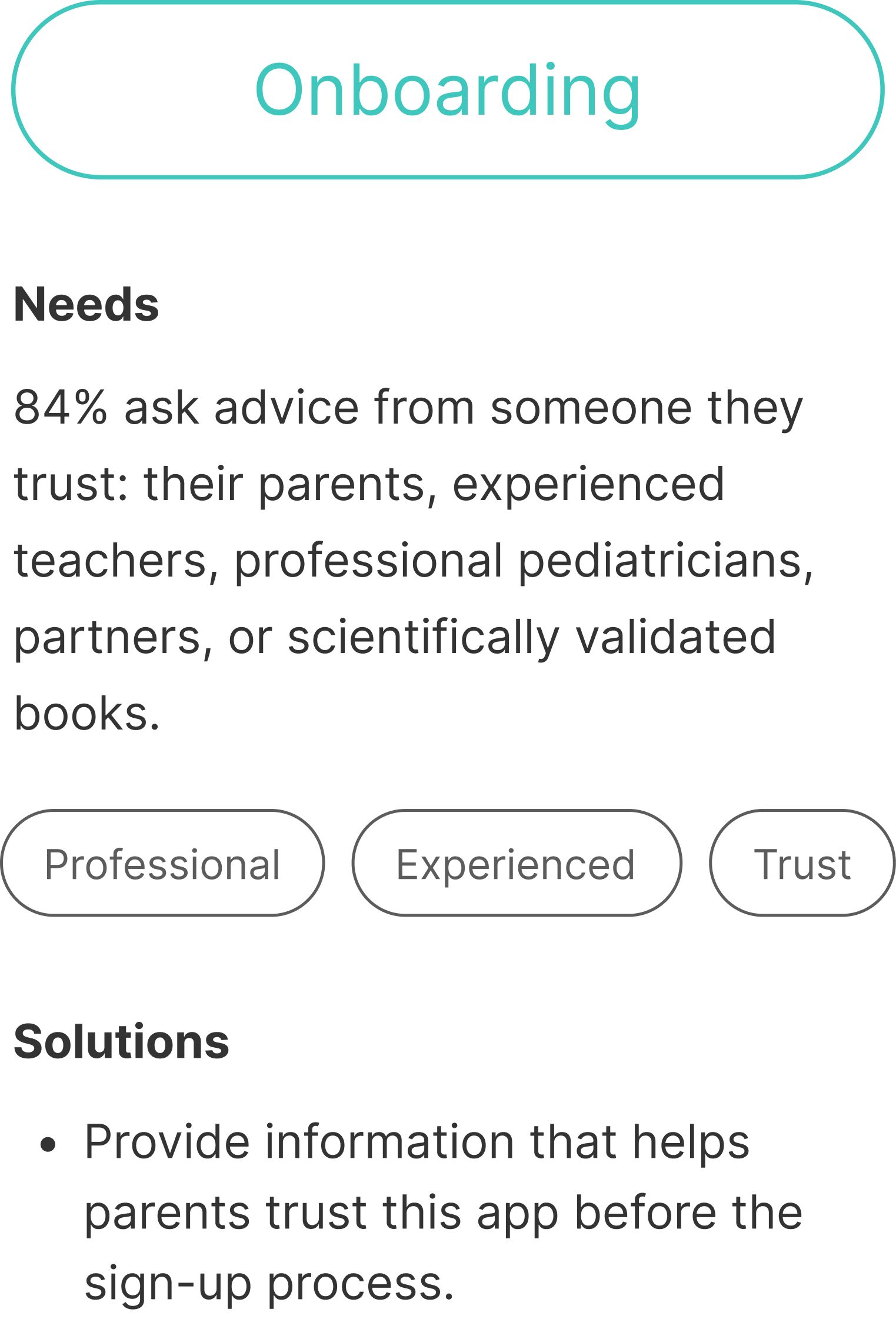
Goal: Build trust, trigger interest, and give reasons to come back
From interviews with parents, I discovered three main causes that make parents distrustful of outside resources, and turned them into a trust-building process: An onboarding function that shows parents the advice:
1) A trust-building onboarding process
is based on scientifically-rigorous solutions.
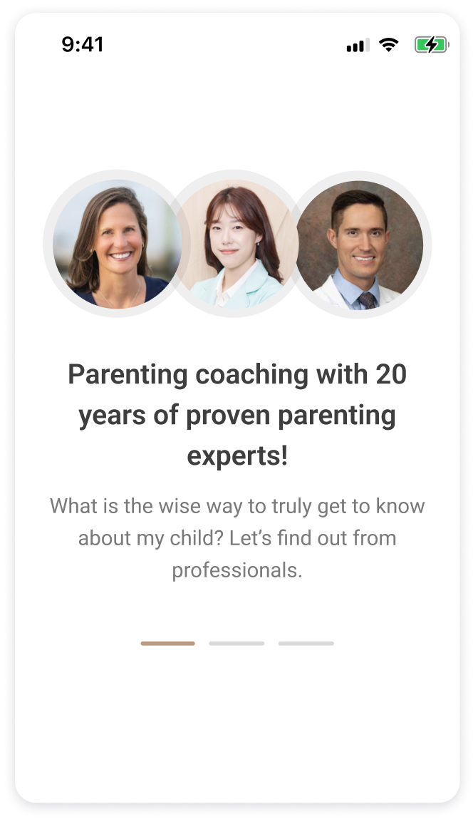
comes from seasoned professionals.
is tailored to each child’s temperament.
This allows parents to gain deeper insight into their children. The goal here is to empower parents with effective approaches to foster confidence in their parenting journey.
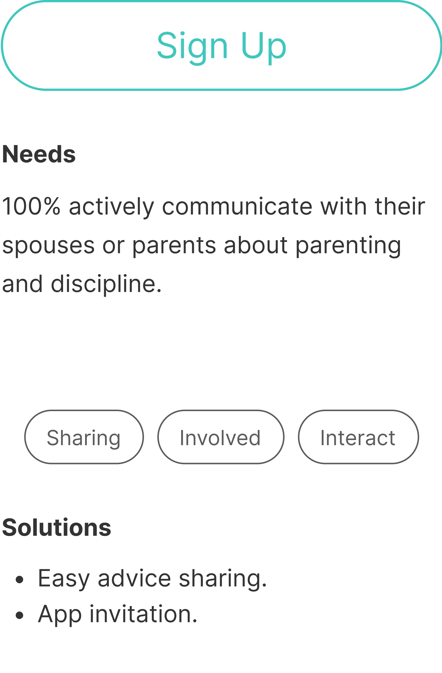
2) A basic survey and a temperament test
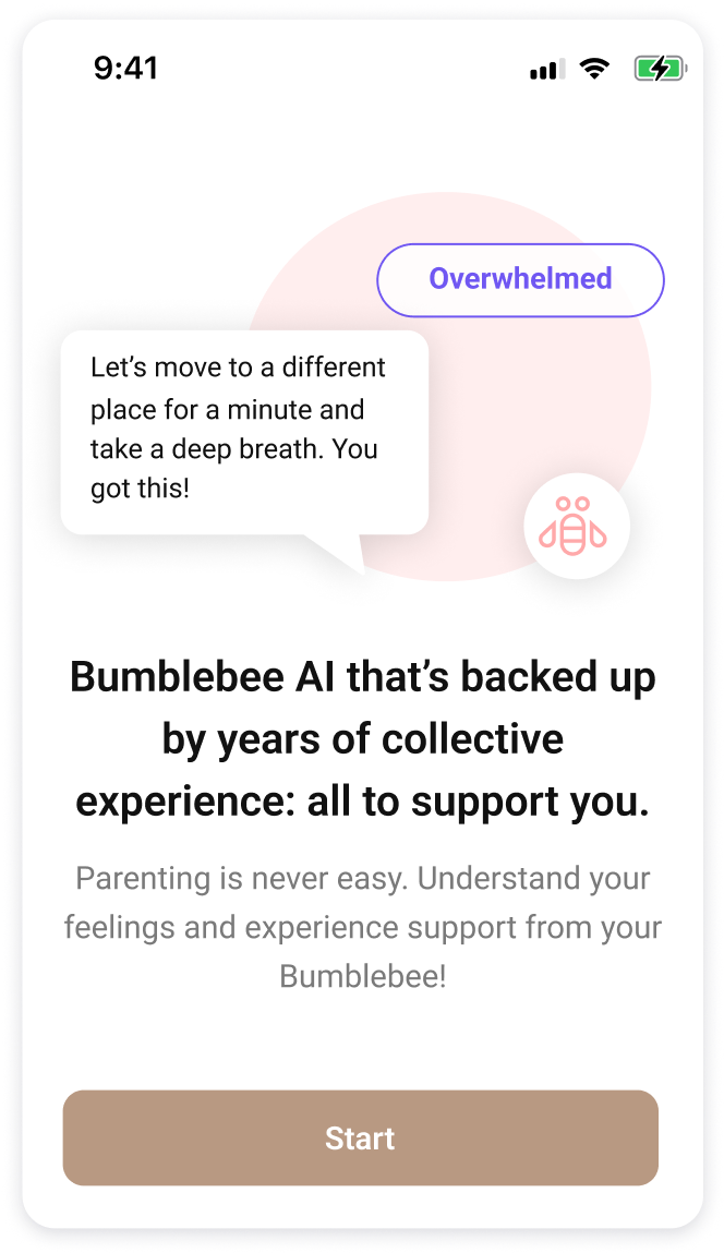
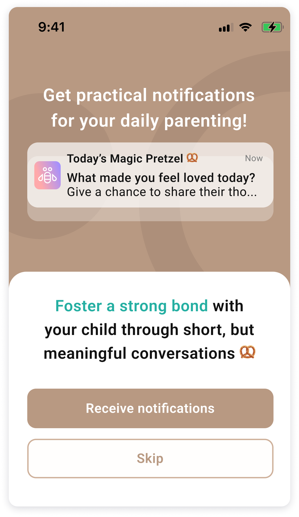
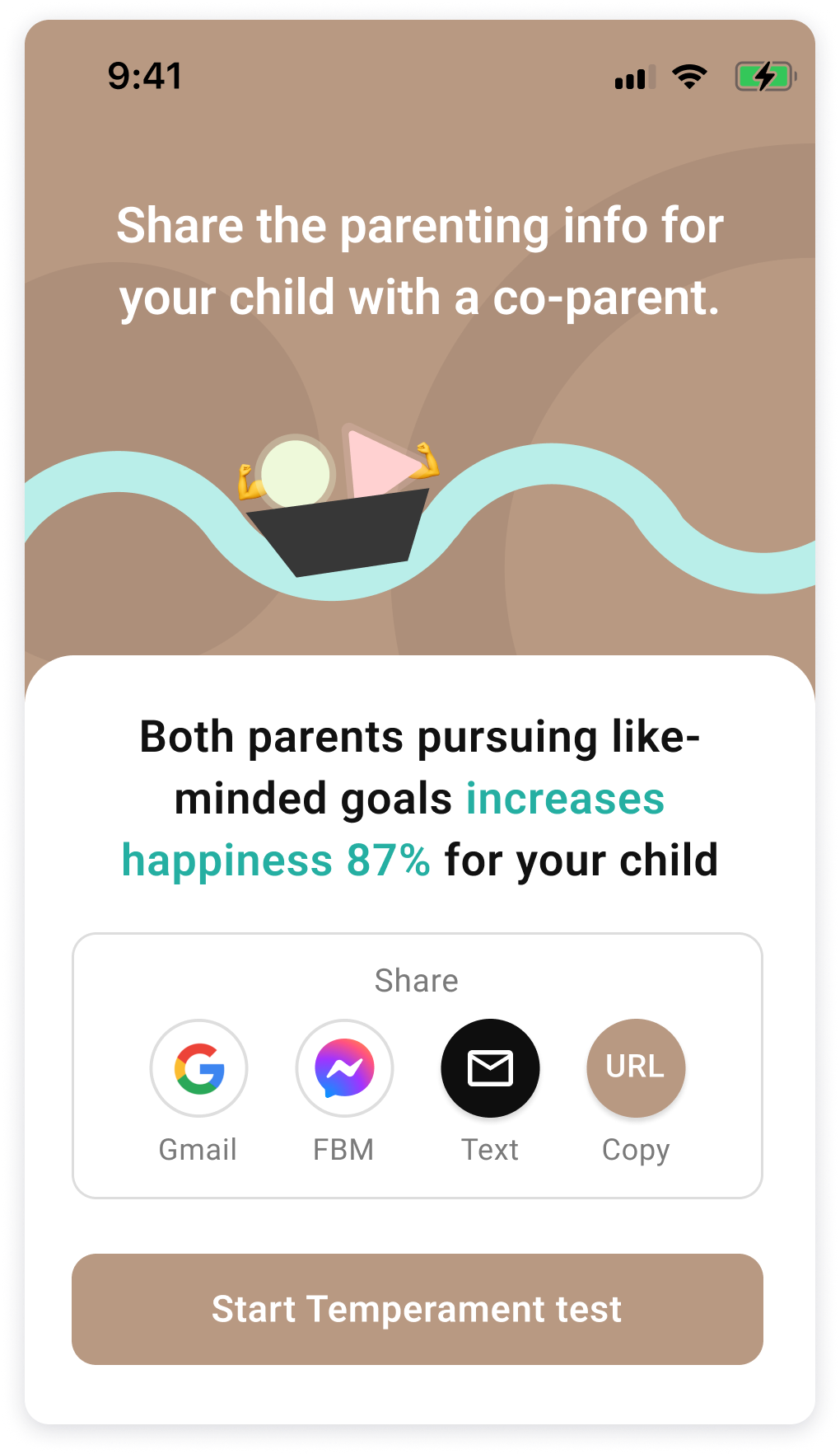
3) Daily parenting push notifications and sharing function
Considering that parents are busy and yet they want to establish emotional bonds with their children, I added a “Magic Pretzel” function that provides questions that parents can ask to start a short, but meaningful conversation with their kids. Also, I found out that there are many other people who are helping to raise kids whether it’s a spouse, grandmother, nanny, etc. They can share a link to spread the same information and pursue like-minded goals.
4) A main page with practical tips derived from the specific test result
I believe a main page should give overall information that triggers users’ interests, while remaining fun and practical.
Bumblebee solves the problem of parents getting stuck trying to find solutions they need. It also supports parents’ emotions by delivering encouraging messages and practical solutions they can try. The calendar not only shows their webinar schedules, but it also indicates child development milestones based on age and the record parents provide of their children’s daily condition.
5) Bumblebee AI and Calendar
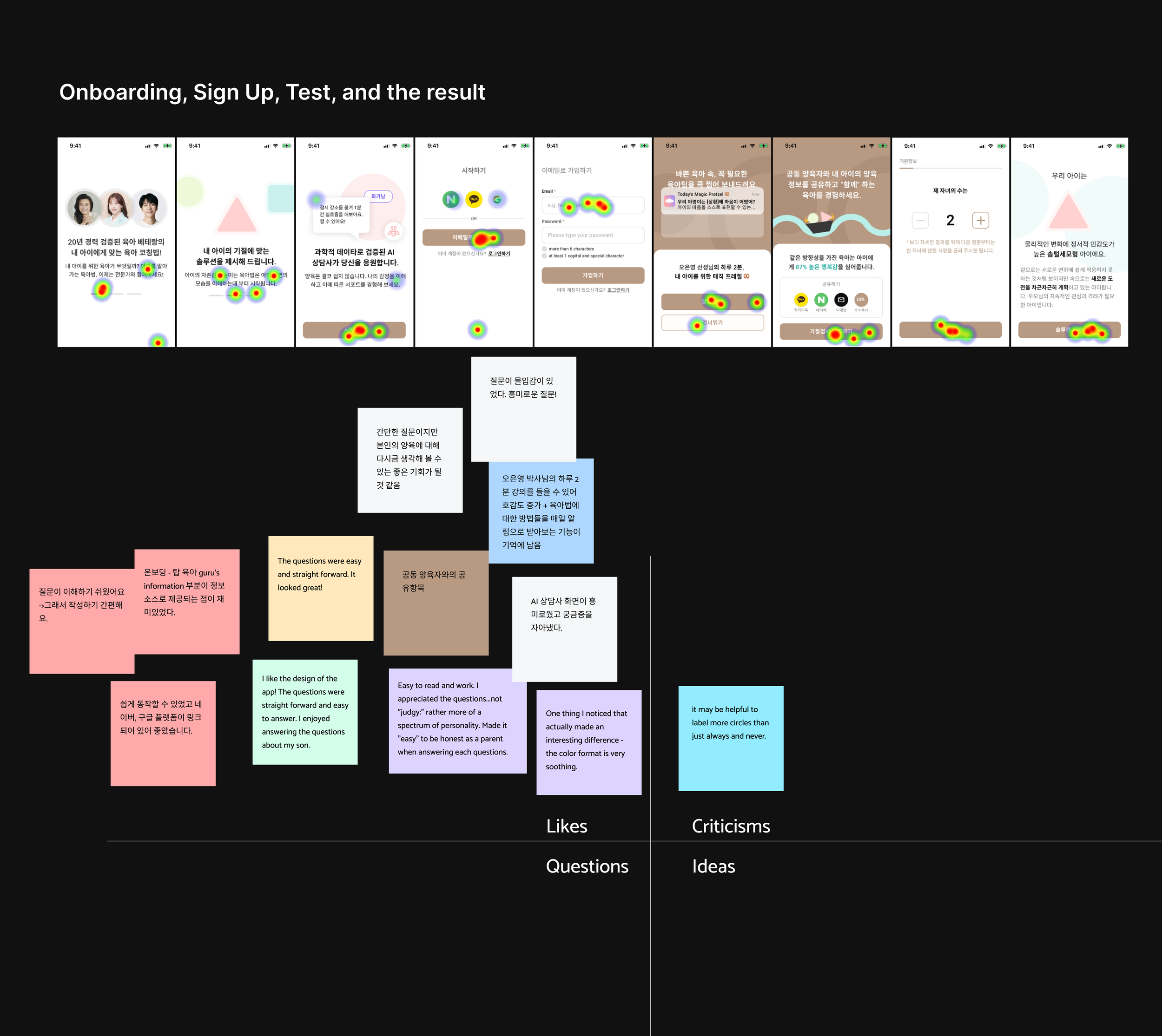
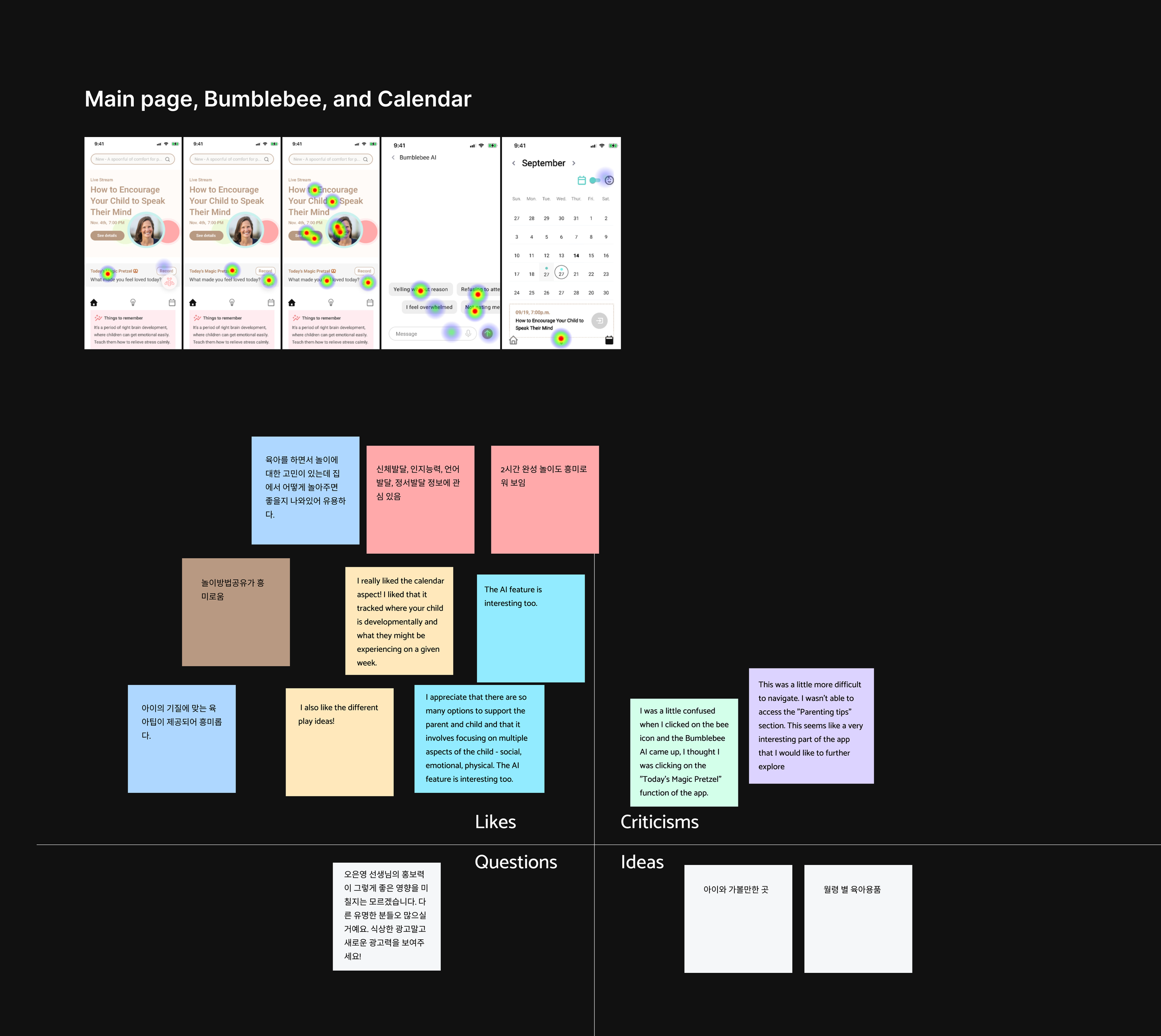
Usability testing that’s as important as User Research!
Usability Testing
9 parents participated in the test and gave me feedback. I created the test using Maze in two different languages: Korean and English. It was because I wanted to see if I could find the common opinions from different nationalities.
Then I mapped out their opinions based on each big step:
Onboarding, Sign Up, Test, Result
Main Page, Bumblebee, and Calendar
General thoughts
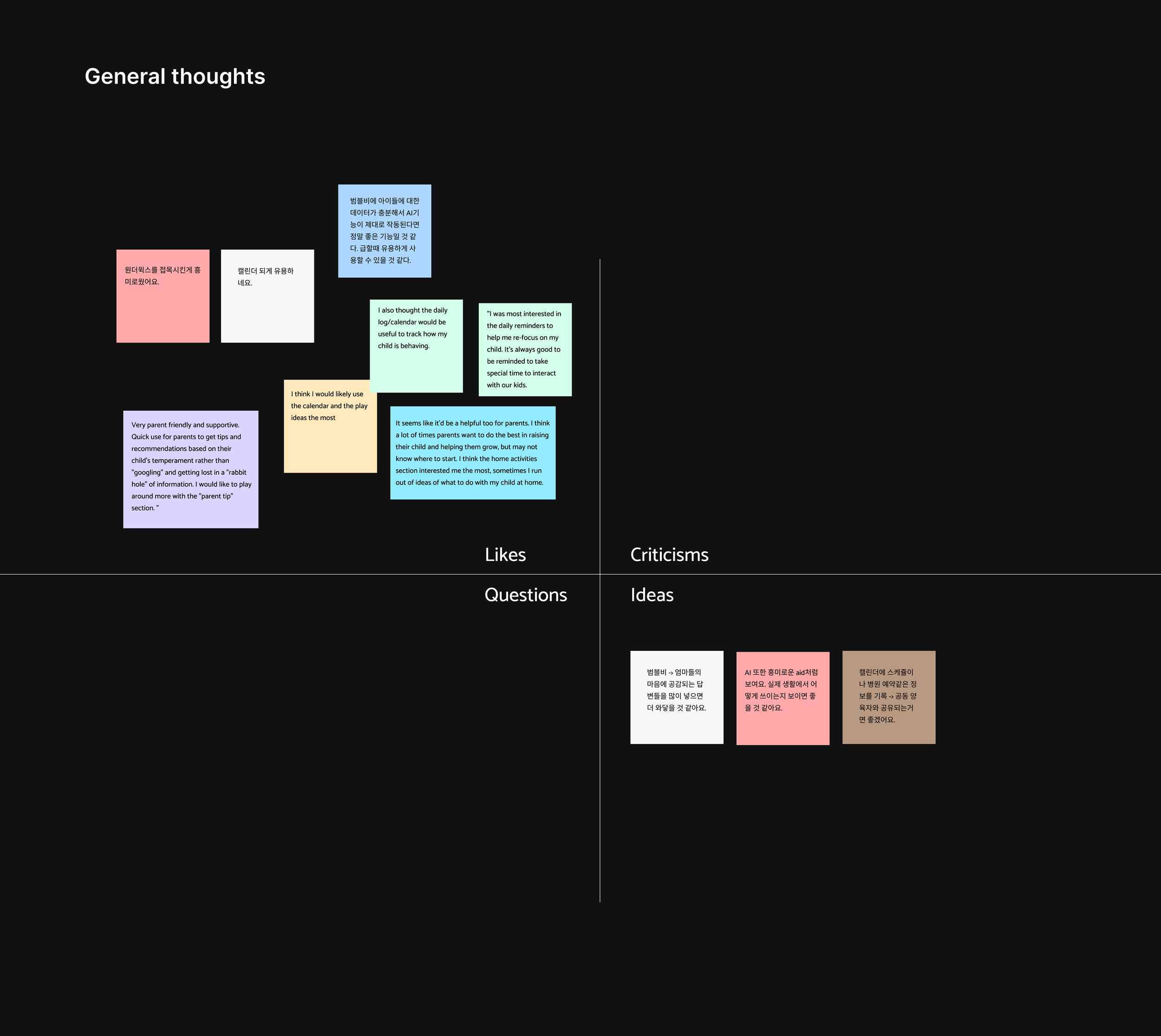
“Very parent-friendly and supportive. Quick use for parents to get tips and recommendations based on their child’s temperament rather than ‘googling’ and getting lost in a rabbit hole of information. I would like to play around more with the ‘parent tip’ section.”
“It seems like it’d be a helpful tool for parents. I think a lot of times parents want to do their best in raising their child and helping them grow, but may not know where to start. I think the ‘home activities’ section interested me the most. Sometimes I run out of ideas for what to do with my child at home.”
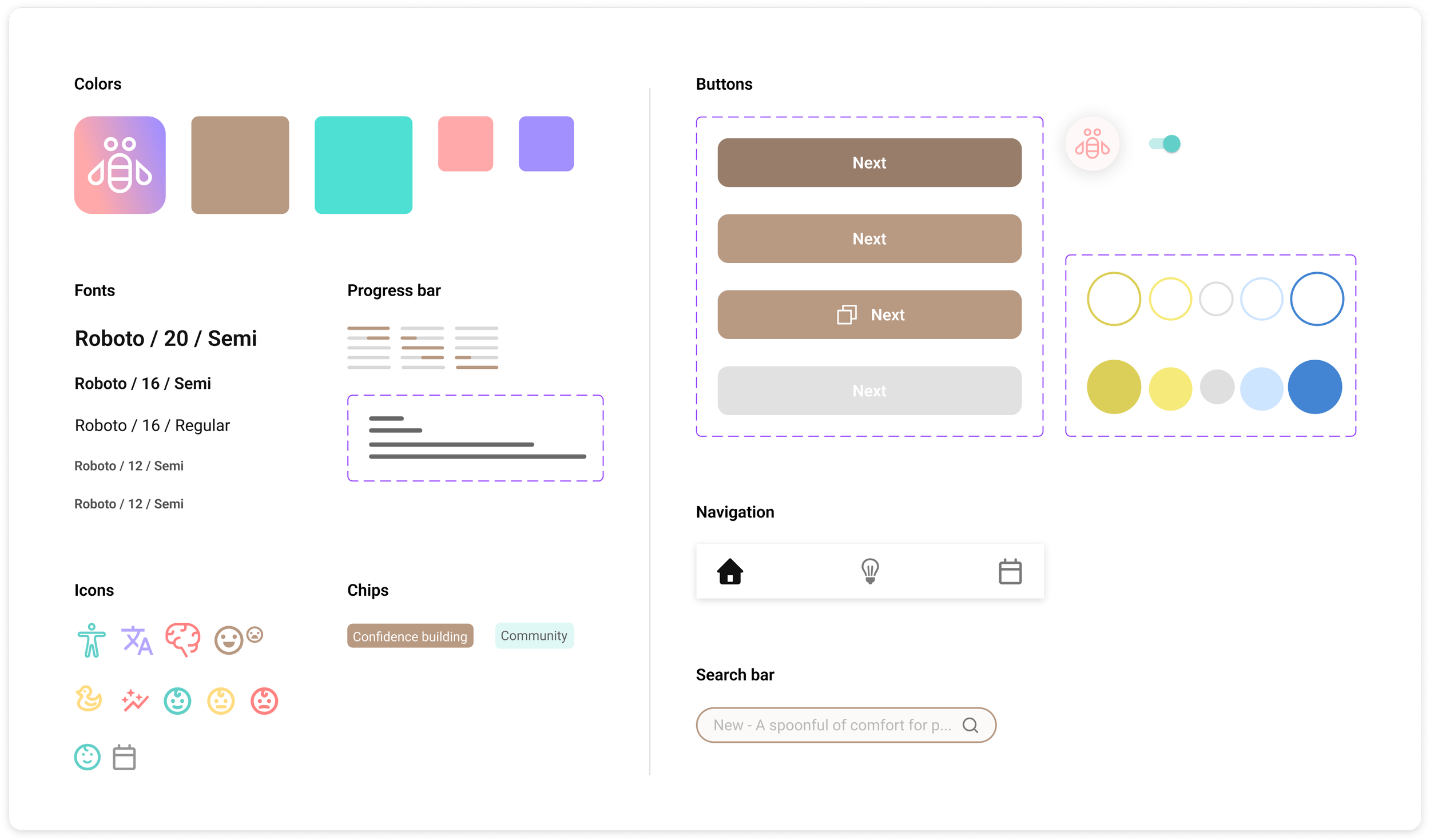
Style Guide
To ensure consistency throughout my design work, I developed a comprehensive style guide when creating components for the app. After careful consideration, I selected #B89982 as the primary color. The inspiration behind this choice stemmed from a conversation with one of the interviewees, which proved insightful. She expressed a desire for the app to evoke calmness and organization, contrasting with the chaos of daily life surrounded by cluttered spaces and scattered toys.
Reflecting on her words, I sought colors that embodied both calmness and cleanliness. Through experimentation during the design process, I discovered that this particular shade of brown not only instilled a sense of peace but also commanded users' attention. Moreover, it resonated with the natural hues of tree trunks—an element universally appreciated for its grounding and stability.
Conclusion
Crystal, whom I was interviewing in my first phase, told me that she probably wouldn’t use the app I was creating. However, she told me later that she was already frustrated about advice she was finding from websites that did not match with her child’s developmental stage. She said...
“After seeing this prototype, I am actually interested in trying it out. Can’t wait to see it roll out in person!”

A self-initiated project aims to enhance the digital coupon experience, involving activities such as conducting surveys among Marin County residents and interviewing users aged 20-60.
safeway re-design
E’nuff platform
A comprehensive translation task management platform. It was a year long team project from research to usability testings.